It’s difficult to redecorate a house when you don’t own one, so that was the first thing to get sorted out. So we bought a domain name and decided to officially establish a “software organisation” called ‘ClosedLess’, which we call home (there will be a separate blog about ClosedLess).
Now we can start the redesign and branding process for our homepage and website.
The Old for the New
Originally the website was setup using a DuckDNS dynamic DNS hostname (which I’ll let Rob talk about more if he wants), meaning the server had no unique identification apart from the name robmc – colloquial for “robert” and “Minecraft”, since he hosts a Minecraft server. The issue with this was that the web server never needed a beautiful looking homepage, nor anything else…until I came along.
Since we have our own separate userspaces, “~theonepath” and “~robert”, the homepage needed to tie everything together into a single location which allowed site visitors to know who we are and allow them to access our individual userspaces, without looking wildly different.
Naturally my userpace was the odd one out since both Rob’s and the homepage followed the gruvbox theme, and both were simple layouts. Mine was meant to look “cool” and “unique”, but actually it had a lot going on which wasn’t required and broke cohesion of the website. Now my userspace is the exact same layout as the homepage and the main website, and Rob’s userspace breaks cohesion when it comes to layout not theme (who’s laughing now, haha? I-It’s still me).
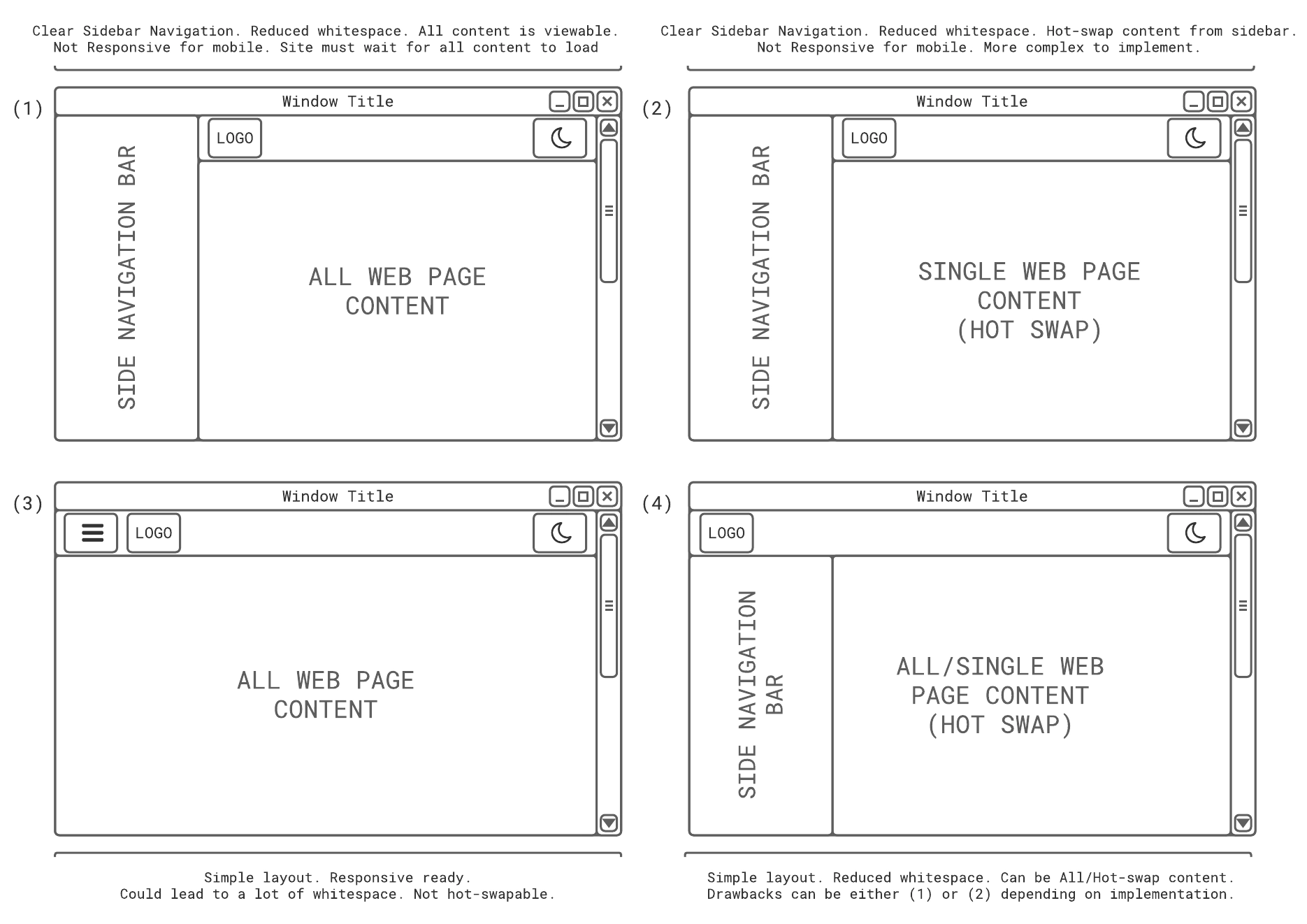
Nonetheless I would provide a before and after of the main site, however I can’t find a picture of the original homepage, which is probably for the best. Let’s now discuss what we have in place. The current design was originally part of four different wireframe designs I made in Lucidchart and had Rob decide which of the four he liked the most. The end decision was (4) as it was the most intuitive design, but behaved like (1) in the sense all the contents of the page was loaded, meaning separate web pages would be created to separate content across the wesite. (4) already had the ability to be either all content or hotswap (You can see the original designs below).
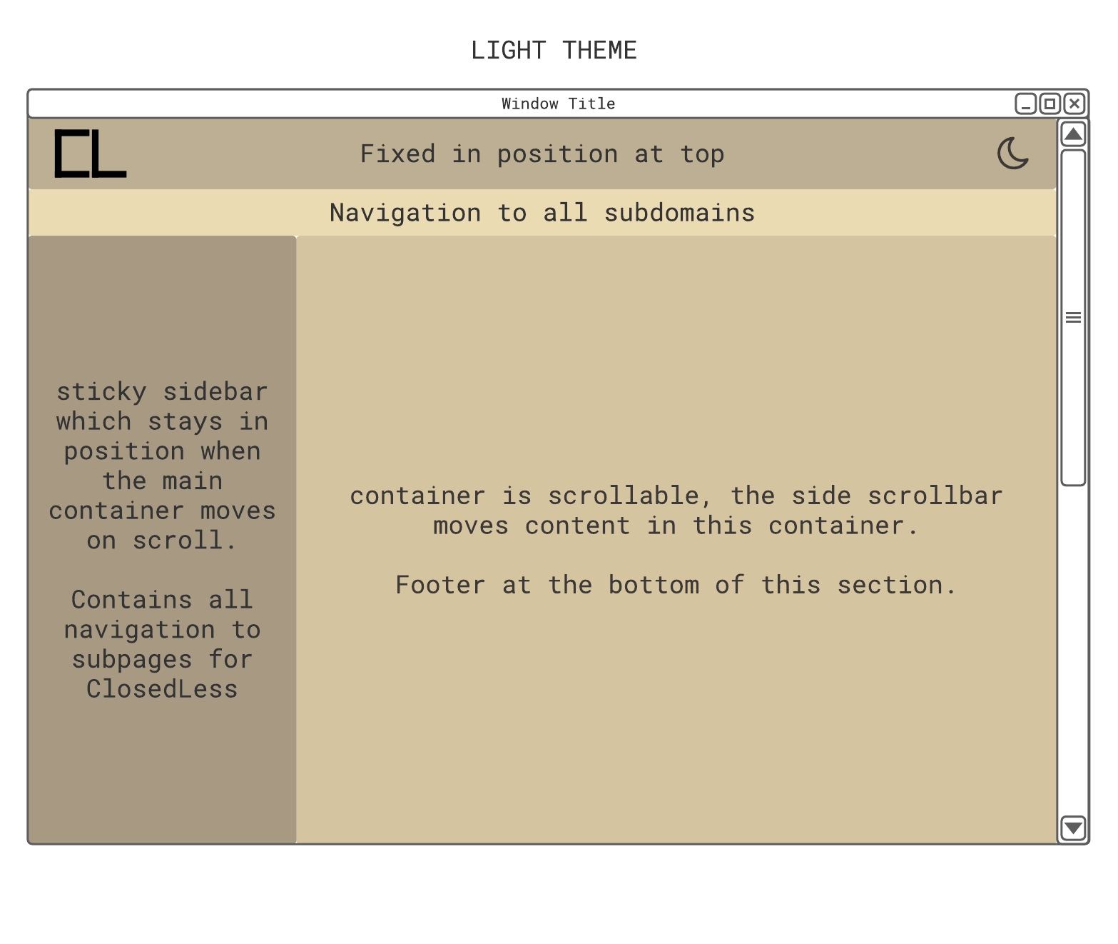
Next was to figure out the colouring and what exactly each component was going to perform. It was clear that the theme was going to be gruvbox since the original homepage used that colouring theme, and Rob had conveniently constructed a CSS stylesheet for the different colours for either light- or dark-mode (which we call dim-mode since “dark” could be misleading in the way we use colours). Applying the colour theme, and identifying what the components did on the web page, I came up with the following mock design:
Yeaaaaah, I might have just ripped off Suckless for their website layout…but I can’t argue, even their website just sucks less. ClosedLess does align itself with Suckless, and I wouldn’t call it stealing or plagiarism; more, incorporating their design into our own and taking inspiration from.
Look, the box above clearly states the sidebar is “sticky…which stays in position when the main container moves on scroll”. On Suckless, this component moves when the main body does as well– yeah no, they had the right idea from the start. Using JavaScript is too much of an inconvenience to calculate the computed y positioning and then use that to determine the top attribute of the sticky element.
Anyways, the final design, layout and content of the homepage can be seen below. You probably already saw this getting to my blogs section, but in case you came via a link (and for clarity of documenting), here’s the homepage of ClosedLess.
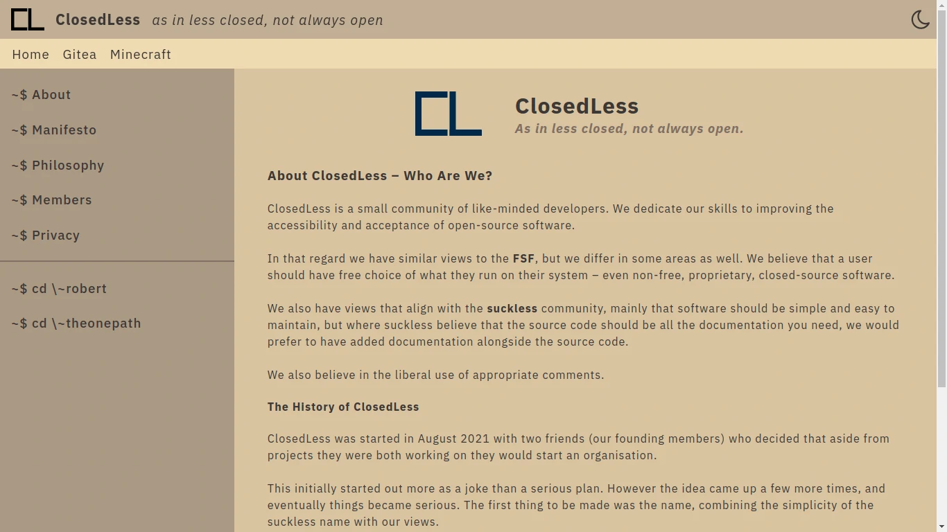
Look familiar? It really does incorporate the idea of sucking less, and, myself and Rob are pleased with the end results.
My Userspace: \~theonepath
As previously mentioned, my userspace was over-engineered and more importantly, broke cohesion. I thought it was unique and different, and for me it was exactly that; however, if you know the second thing about UX web development, it’s that responsiveness is key to having a brilliant website – the first thing is crying over CSS style attributes. Since I developed the frontend for ClosedLess, naturally I carried that into my own userspace.
Unfortunately, or possibly fortunately in hindsight, I still have screenshots of my initial design for my userspace, which looked like the following:
The Homepage: 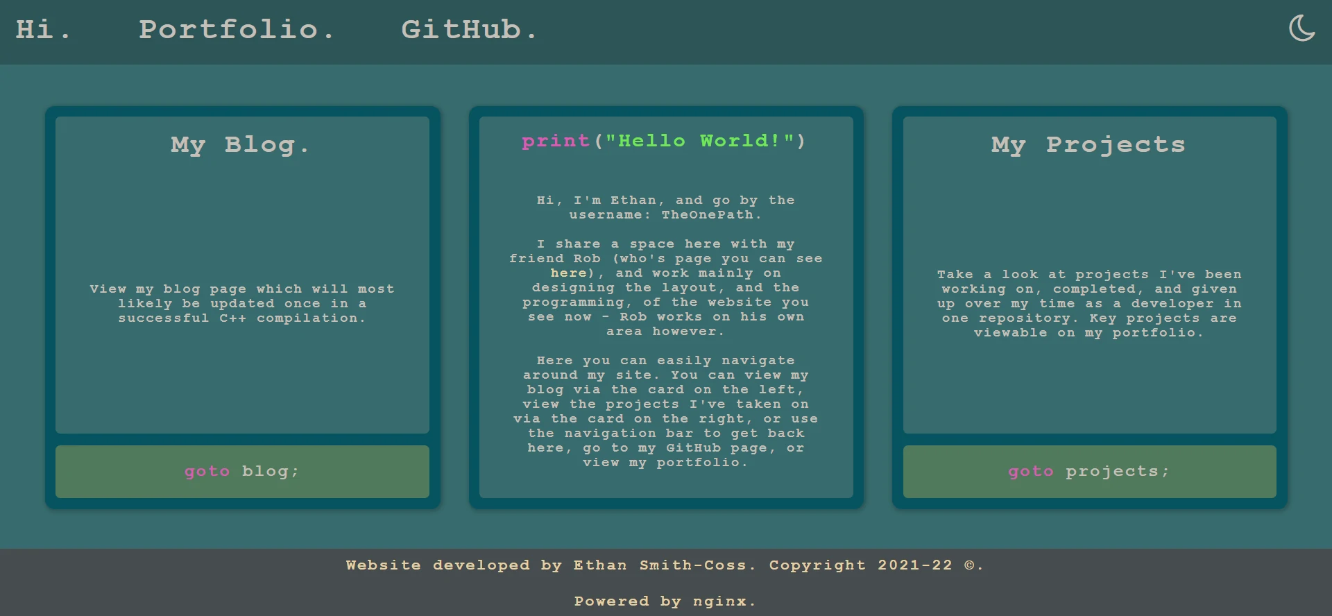
A Blog Post Page: 
Looking back to what I had and what I have now, the large margins for the blog posts are convenient for reading. If I recall, the eyes can get fratigued from continous horizontal reading, and moving to a newline can help with reading for longer periods. Don’t quote me on this but I will consider the larger margins for this reason and implement the changes seamlessly.
However, for the rest of the web pages, I’m significantly happier with the new design over the old. If, again, you haven’t seen my new userspace layout, below is how it looks now (and for comparative reasons, it’s best I show in this blog):
The Homepage: 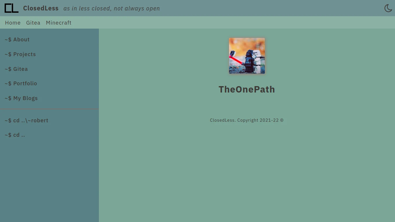
The Blog Index Page: 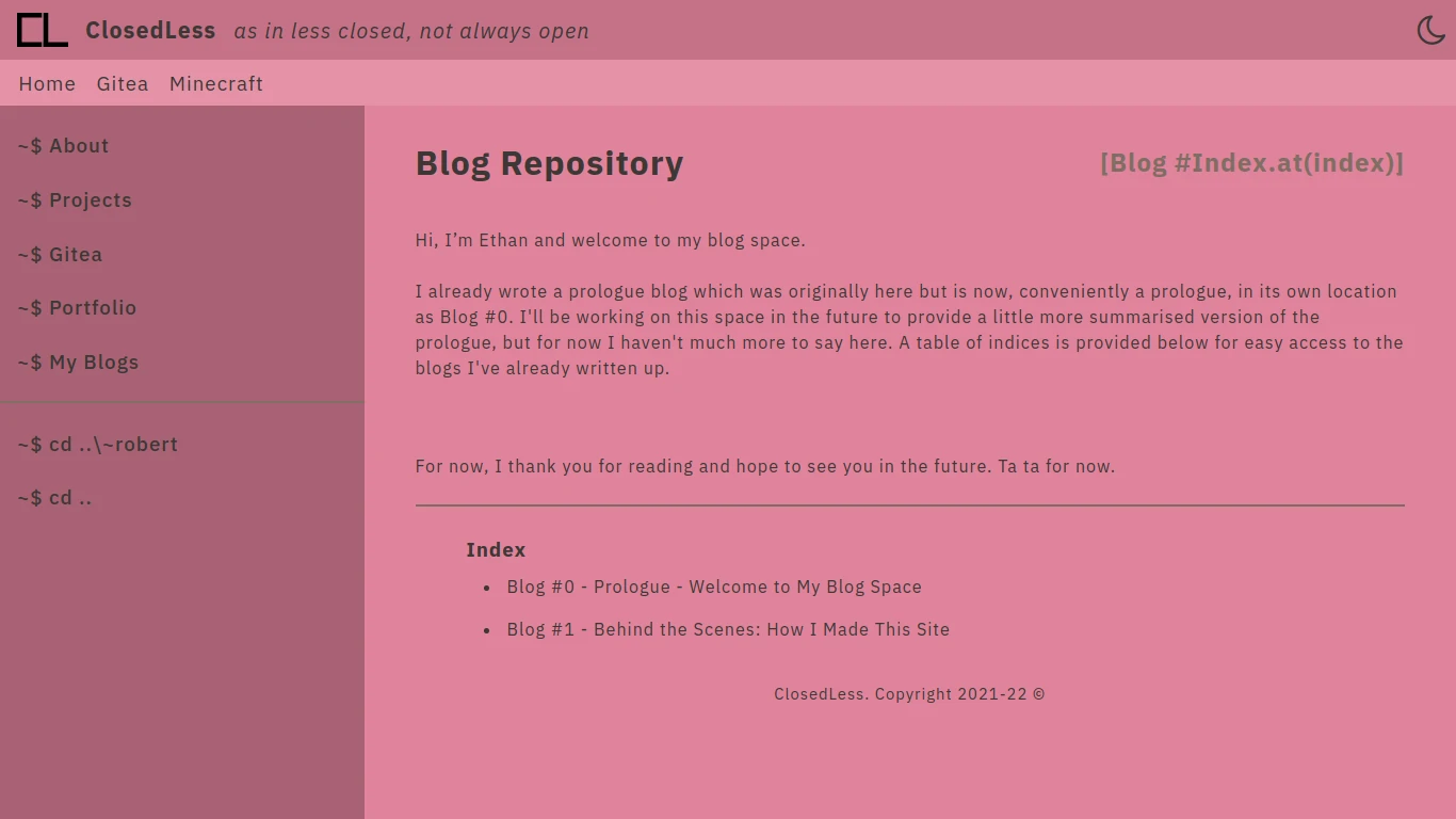
My userspace uses a colour palette which cannot all be found in gruvbox. The main section, or body of the web pages, I use a gruvbox defined colour; however, since I wanted to keep the variety of different shades/tints which can be seen throughout ClosedLess, I needed to define custom colours. Those colours are defined as below:
Custom gruvbox-style colours
/* custom colour themes with respect to gruvbox-themes */
:root {
    --blue-bg1: #93B0A5;
 /* --blue-bg2: #83a598 | var(--gruv-blue-alt-2) */
    --blue-bg3: #769094;
    --blue-bg4: #628085;
    --purple-bg1: #D995A8;
 /* --purple-bg2: #D3869B | var(--gruv-purple-alt-2) */
    --purple-bg3: #B97588;
    --purple-bg4: #9E6474;
}


[data-theme="dim"] {
    --blue-bg1: #065969; /*#03333C;*/
 /* --blue-bg2: #076678 | var(--gruv-blue-alt-2)*/
    --blue-bg3: #267989; /*#2F5359;*/
    --blue-bg4: #418A98;/*#458C9A; #42666D;*/
    --purple-bg1: #7D3763;
 /* --purple-bg2: #8F3F71 | var(--gruv-purple-alt-2) */
    --purple-bg3: #9D5783;
    --purple-bg4: #AB6F94;
}
That about concludes this blog. As is clear above, my userspace is very respectful to the ClosedLess theme and layout, both of which I am proud of with how they turned out in the end. Now, I wouldn’t call what I’ve done ricing, just ultimately made it suck less. If you’re looking for a technical in-depth explanation about how the “under the hood” is designed, then you can refer to my first blog, Blog #1 - Behind the Scenes: How I Made This Site.
Well that’s about it, thanks for reading and ta ta for now.